The Secret Behind Wendy’s Logo: A Delicious Mystery!
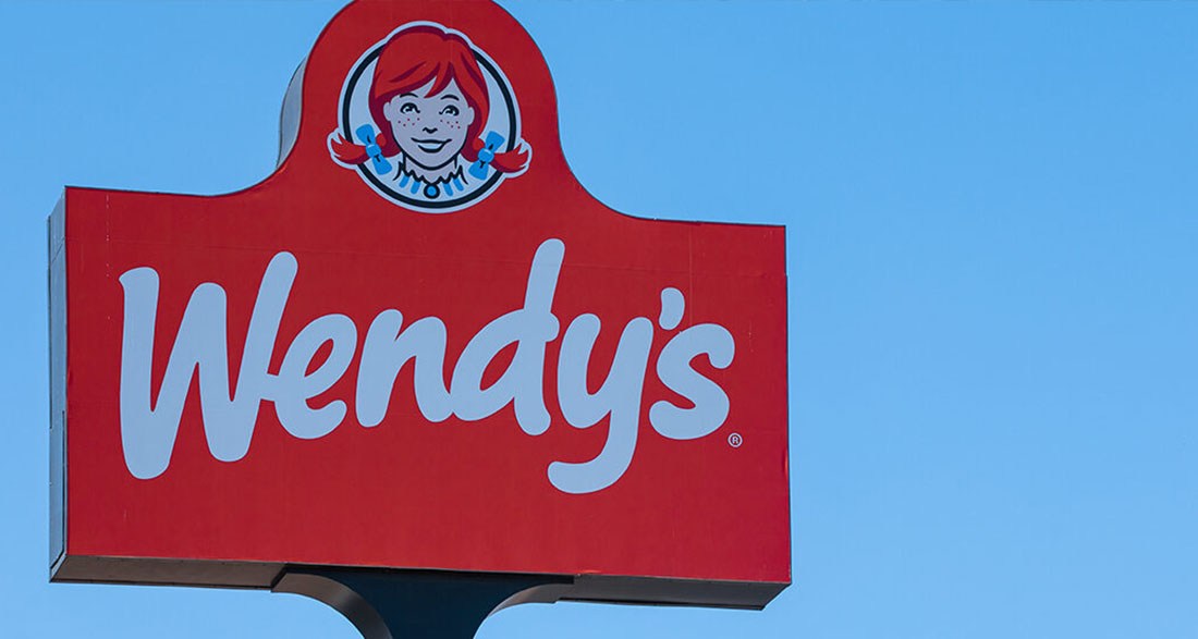
If you’ve ever visited Wendy’s, you know the cheerful girl with the freckled face and bright red pigtails who represents the restaurant. She’s more than just a logo; she’s a symbol of comfort and home cooking that makes fast food lovers feel warm inside.
In 1969, when Dave Thomas opened the very first Wendy’s, he wanted the restaurant to reflect the friendly and inviting spirit of his daughter, Melinda Lou “Wendy” Thomas (now known as Wendy Morse).
“He wanted a character, because he worked for the Colonel at Kentucky Fried Chicken and knew how much that persona mattered,” Wendy shared about her dad’s vision for the logo.
“He said, ‘Wendy, pull your hair up in pigtails.’ So, I did. He got his camera and took pictures of me and my sister and said, ‘Yep, it’s going to be Wendy’s Old-Fashioned Hamburgers.’”
Isn’t that a fun story? From those simple beginnings, Wendy’s has grown into a beloved fast-food chain known for its delicious old-fashioned burgers, creamy Frosties, and hearty chili. Over the years, the menu has expanded, but the logo of the red-haired girl in a blue and white striped dress remains iconic.
A Fresh Look with a Touch of Nostalgia
About ten years ago, Wendy’s decided to give the logo a little makeover. They kept the spirit of the original design but made it look fresher and more appealing to new customers.
The updated logo softened Wendy’s features and refined the font, making it attractive to both longtime fans and newcomers. This clever balance of modern and classic keeps the logo feeling timeless while still reminding us of the past.
But here’s where it gets really interesting! Some people have noticed something unusual about the logo. They believe that there’s a hidden message on Wendy’s collar that might be playing tricks on our minds.
“Some say that this makes you associate the brand with the comfort of home cooking. Although this is something you may not notice consciously for years, it will leave an imprint on your brain,” explains a logo expert who studies branding.
The Hidden “Mom” Mystery
Can you see it? If you look closely at Wendy’s frilly collar, you might spot the word “mom” hidden in the design! Once you see it, you can’t unsee it!
According to Business Insider, this “mom” effect is most noticeable in the all-red version of the logo, which is often found on Wendy’s Styrofoam cups. The way the collar curves creates an illusion that resembles the word “mom.”
When asked about this intriguing theory, a Wendy’s spokesperson responded, “We are aware of this and find it interesting that our Wendy cameo has ‘mom’ on her ruffled collar. We can assure you it was unintentional.”
So, while the hidden “mom” message might not have been planned, the warm and family-friendly vibe of Wendy’s is definitely part of the brand’s charm.
What Do You Think?
Isn’t it fascinating how a logo can carry so much meaning? Even though the hidden “mom” theory has been debunked, the feeling of warmth and family that Wendy’s represents is a big part of what makes it special.
What do you think about the unexpected message in Wendy’s logo? Have you noticed the “mom” connection before?
We’d love to hear your thoughts! Share your ideas in the comments below, and don’t forget to share this story with your friends so we can hear what they think too!

